TIPS & TRICKS FOR DAILY LIFE
Tips & Tricks to Handle Any Color-related Situation You Might Face
This course is your chance to "refine" your life and get all of the best strategies for taking control of your color choices, becoming a pro at color matching, breaking down the limits and stigma, and enjoying your new SELF!
Click here to start this FREE online course from the beginning.
4. COLOR SCHEMES
Color plays a vitally important role in our lives. Color can sway thinking, change actions, and cause reactions. So we should learn how to use them in our daily lives, and that's why we should know how to use color schemes.
Study this part again and again until you understand it fully because we will use color schemes in all the designing projects and even when setting our outfits.
Color schemes are used to create style and appeal. Colors that create an aesthetic feeling when used together will commonly accompany each other in color schemes.
A good way of combining colors is to think about where you can find them in nature.
So we want to learn which color combinations create pleasing contrasts and consonances using the color wheel.
.jpg)
-
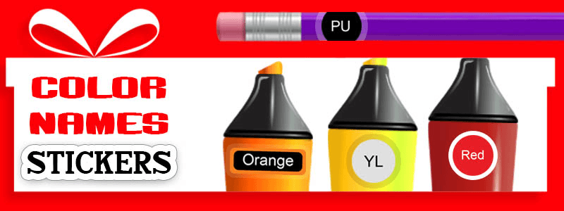
MONOCHROMATIC COLOR SCHEME
Mono means one, so we're using one color tints, tones, or shades. Same as the Red paint which we saw before.
.jpg)

By using shades and tones of one color, you'll find you have a successful color design just as in the examples.
The majority of the room in this room would be pale blue by using different proportions of the blue color. You could have a mid-tone blue sofa and then use a darker blue for smaller accessories or artwork on the wall. It will be a good color design.
.jpg)
As you can see, you can look stylish with this simple color scheme.
So I suggest you add some blue to those black & white projects or outfits and see how they look.
.jpg)


What is the Monochromatic scheme of Blue in nature? Of course the blue sea and blue sky on the top.
How does this cool color feel? Calm and relaxing right?
.jpg)
-
ANALOGOUS COLOR SCHEME (HARMONIOUS)
Harmony is the combination of simultaneously displaying colors that produce a pleasing effect.
.jpg)
An analogous color scheme is when we use colors next to each other on the color wheel (usually use 2 to 5 colors, maximum 6).
The analogous scheme is often found in nature and is harmonious and pleasing to the eye. We could have green and yellow, like a tropical trend. We feel comfortable with this color scheme.
.png)
Many people like this color scheme because they can use all of their favorite colors and natural hues to balance the space or go bold for a dramatic look.

-
COMPLEMENTARY COLOR SCHEME
If you want some energy and some life into your project, we could go with a Complementary or contrasting color scheme.
Complementary is where colors are opposite of each other on the color wheel.
It’s naturally pleasing to our eyes. But you should know that we won’t use them equally. We should use one color predominantly, generally the weaker color. For example, using distorted green for most of the scene and then using some saturated splashes of red for some areas.
.jpg)
.jpg)
You don't have to use the same portions of the color so you could do 80% green and then just add in 20% red or opposite.
VIOLET and YELLOW
This is another example and portions are like
60% purple, 30% dark purple, and 10% yellow.
.jpg)
BLUE and ORANGE
Blue and orange color schemes bring popular and modern color combinations into interior design, adding warmth and cool details to home decor is a relaxing and beautiful style.

-
SPLIT COMPLEMENTARY COLOR SCHEME
A split complementary scheme involves the use of three colors. Start with one color, find its complement, and then use the two colors on either side of it.
For example, the complement of red is green and the split complement of red would be blue-green and yellow-green. These colors are not so easy to see for colorblind people so we can use the triad complementary color scheme which I will explain in the next part, it’s very similar to split complementary.
.jpg)
-
TRIAD COMPLEMENTARY COLOR SCHEME
The triad scheme is another three-color scheme that's easy to execute. As with the split complementary find the one color you want to use and then locate the other two colors adjacent to the split complementary colors.
%20(1).jpg)
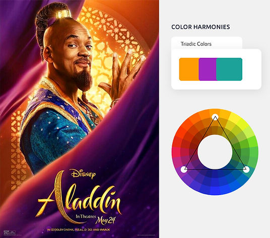
For example, this picture highlights blue, red, and yellow in tints of each hue. Using three colors in this manner creates another wonderful harmonious look. The look can be dramatic, warm, cool, or soft, depending on the tints and shades chosen.

In the "End of summer sale" advertising, you can clearly see how it’s eye-catching it looks using this scheme.

-
TETRAD OR DOUBLE COMPLEMENTARY COLOR SCHEME
A special variant of the dual color scheme, with equal distance between all colors. All four colors are distributed evenly around the color wheel; there is no clear dominance of one color.
We can use this double complementary scheme in two ways, as you can see here:
.png)

RECAP