TIPS & TRICKS FOR DAILY LIFE
Tips & Tricks to Handle Any Color-related Situation You Might Face
This course is your chance to "refine" your life and get all of the best strategies for taking control of your color choices, becoming a pro at color matching, breaking down the limits and stigma, and enjoying your new SELF!
Click here to start this FREE online course from the beginning.
5. SET YOUR OUTFITS
How To Know What Colors Match?
Mapping colors to your clothes is as much science as it is an art.
It can be hard to inject color into your wardrobe, and it's easy to stick to the basic grays and blacks.

(An OfficeTeam survey revealed that 80% of executives believe an employee’s clothing choices affect their chances of promotion) providing the motivation, you will approach the same exciting if foreboding choice: “do I keep my familiar old wardrobe, or reach out towards something more?”
This guide is for those who aspire.

The Best Color Combinations for Your Clothes
Neutral colors consist of black, white, grey, browns, and beige. They’re called neutral because they’re not overpowering.
They’re infinitely mixable and extremely versatile. I’m sure you have a lot of clothes in these colors in your wardrobe, and you know how to put them together.
BLACK and WHITE
You literally cannot go wrong when pairing black and white. No one will tell you it’s a weird color combination. In fact, the high contrast gives a clean and elegant look.
Here I will review the meaning of each color and, with a few examples, explain how to use color schemes to look more stylish.
WE WILL BEGIN WITH THE PRIMARY COLORS:
"RED" means danger, passion, anger, immediacy, and love.
Red is a naturally warm and attractive color. It’s bold and eye-catching.
Red can be quite severe when paired with black, white, and other neutral colors.
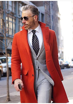
Avoid wearing red accessories with red clothes as it seems overdone, instead go for gold, silver, or white accessories.
COLOR SCHEMES
For Monochromatic colors scheme;
Since red is loud enough to make a style statement, just use a few pieces of your cloth in red color and keep the rest of your outfit simple.

For Analogous colors scheme;
The red color is on the top of the color wheel, so if we use red with red-orange and red-violet, it’s an analogous color scheme with 3 colors from the middle of the color wheel. To have more colors, you can add orange and violet from the same side of the color wheel.

For Complementary colors scheme;
The best colors to wear together are shades that are complimentary of each other. In the world of color, this means shades that are opposites of each other on the color wheel, so the Complementary color of red is green.

For the Triadic colors scheme;
The term triad is given to three shades in the color wheel that are equal distances apart from each other. In our case, we will go with Red, yellow and blue.

For the Tetrad colors scheme;
Using the tetrad colors scheme means using a lot of colors for your outfit and accessories. Except for some unique colorful designs, I don’t suggest starting with tetrad colors. We might go wrong with the shades, and because most of the colorblind people watching this course are male, and I don’t think we will feel comfortable wearing all of these bright colors suddenly, but for women, of course, it's okay. So as I said from the first, we will go minimal and simple.
BLUE: TRUST, CALM, STABILITY
Got an interview you need to nail or a first date you’re excited about? Blue is the way to go. The color conveys friendliness and loyalty, all while helping you project confidence. Lighter shades will keep you calm, while darker shades convey trustworthiness.
You can pair jeans with anything and any color and look truly stylish. The secret is starting with the right jeans.

Keep in mind that color schemes are the standard way of using colors, but it doesn’t mean we can’t change it a little bit, especially in the fashion world it’s common because it has its roles.
COLOR SCHEMES
For Monochromatic color scheme;
Wearing one color is anything but boring! But let’s have a look at how, by using different shades of blue, we can look stylish.
For Analogous colors scheme;
We can use the blue color in different shades with blue-green, even we can use blue color with blue-violet and blue-green and violet. It depends on how you use the color wheel.
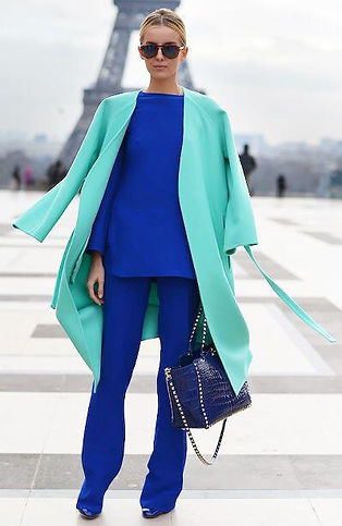
On the color scheme, we can use blue color till red on one side and on another side blue color until yellow.

For Complementary colors scheme;
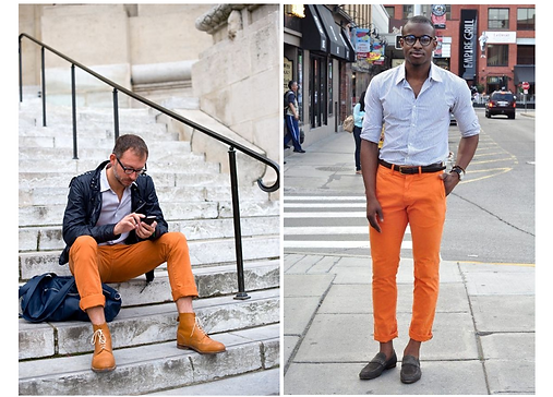
The complementary of blue color is orange. These two shades look amazing together; orange is a bright color that attracts attention, while blue is a complementary color that ideally tones down the brightness and harmonizes other shades.

For split Complementary colors scheme;
The complement of blue is red-orange and yellow-orange.

YELLOW: ATTENTION, WARMTH, ENERGY
We need to use yellow color sparingly because it can be overpowering.

COLOR SCHEMES
For Monochromatic colors scheme;
Actually, yellow has more than a dozen variations, with the primary yellow tones being pale yellow, light yellow, greenish-yellow, and yellow with a grayish undertone. So before deciding to wear yellow clothing, first find out which shade flatters you the best. You can wear yellow on yellow if you are using different shades for harmony.

For Analogous colors scheme;
For using 3 colors: We can use yellow with green color on one side of the color wheel and yellow with orange color on another side.
Yellow and Green, in combination, are a soothing and undramatic relationship. Even we can see these two colors beside each other on the rainbow.

Yellow with Orange: Matching these two sister hues that come so close to each other in the color wheel, you create the most joyful color combination.

For using 5 colors we can use yellow till blue, and as I said before we can use only three colors like yellow, green and blue, Or yellow, orange and red.

For Complementary colors scheme;
The complementary color of yellow is purple and violet. You can never make a mistake, experimenting with these lovely color combos.

For split Complementary colors scheme;
Split Complementary color of the yellow is red-violet and blue-violet.

SECONDARY COLORS
Approximately it was most of the information that you needed to learn about matching your outfits. And with this information from now on, you can look stylish. Don’t be scared of colors and try something new at times. By keeping it neat and simple, I'm sure that everything you choose will look great.
GREEN COLOR
Most men tend to overgeneralize colors and by calling them red, blue, gray, or green. But there are lots of different greens. There are emerald greens, olive greens, and medium greens. You could also have light greens and all kinds of different shades, including forest greens, racing green and mild olive green.
COLOR SCHEMES
For Monochromatic colors scheme;

For Analogous colors scheme;

For Complementary colors scheme;

For the Triadic colors scheme;
The triadic color scheme of green color is violet and orange, it's the same for the triadic color scheme of orange and violet too.

ORANGE COLOR;
The color orange radiates warmth and happiness, combining the physical energy and stimulation of red with the cheerfulness of yellow.

For Monochromatic colors scheme;

For Analogous colors scheme;

For Analogous colors scheme;
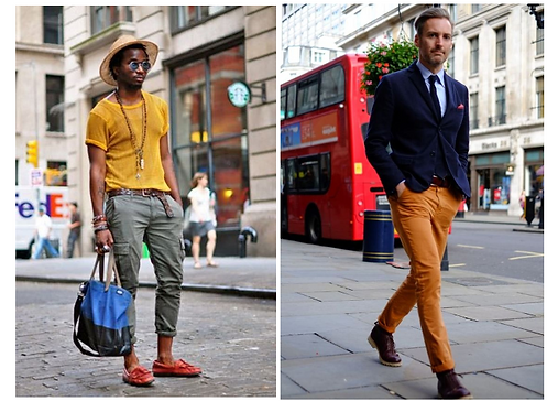
VIOLET & PURPLE COLOR;
Purple combines the calm stability of blue and the fierce energy of red. The color purple is often associated with royalty, luxury, power, and ambition. Purple also represents the meaning of wealth, creativity, and wisdom.
Wearing a purple or violet outfit says that you are confident about your taste and yourself.
Purple is one of those colors that most men do not wear enough of. It does a great job of making everything you wear look fresher and way less boring. But the color doesn’t have to be bright and bold.

For Monochromatic colors scheme;

For Analogous colors scheme;


In this part, I want to explain a few more colors that can help you to look more stylish. It is important to know how we can match these colors together;
BEIGE, TAN & CREAM COLOR;
Browns with orange are the colors we associate with the term “beige”.
Browns with yellow constitute the “tan” shades.
Beige is described as a grayish tan, a light-grayish yellowish brown.
They offer endless styling opportunities. Wear different shades of beige and tan from head to toe and add flashes of one color to really bring the look to life.
The cream is the pastel color of yellow, much as pink is to red. By mixing yellow and white, cream can be produced.
Because yellow works great with blue, cream does too. By extension, it pairs well with any other colors related to yellow.


BROWN COLOR;
Brown is warm and surprisingly flattering. It also pairs well with a wide array of colors and lends itself nicely to other trends currently sweeping through menswear, particularly textured fabrics and mid-century style.

What Color Should my Tie Be?
Choosing your tie color all comes down to the color of the shirt it’s going over.
Ties are attention grabbers. When paired with a complimentary shirt, choosing a tie that stands out against your shirt, means picking a tie that's a darker color than the shirt itself.
For whites and other neutral colors, this means that almost any tie will work. However, for dark or bold-colored shirts, this can be more difficult.
If you're wearing a black shirt, all ties except black ones will be brighter than your shirt, so you may want to pick a tie that strikes a bold contrast - for instance, a white one.
Don't pair a boldly-colored solid-color tie with a shirt that's also boldly-colored unless you're sure the combination works. Avoid extreme contrast - a cherry red tie and a bright green shirt, for instance, will be difficult to pull off.
For a patterned tie, pick a tie containing a color that's similar to your shirt's and not the same as your shirt's.
Matching a Suit to Your Shirt and Tie
Solid-color suits that are black, grey, or navy blue will work with most shirts and ties combinations. In addition, these suits are appropriate for a variety of occasions - from joyous events like weddings to somber ones like funerals. Most men should have at least one suit of these colors.
Match a dark-colored suit with a neutral shirt and a dark-colored tie for a universally-dignified look. Brighter ties can work well with dark suits but can appear informal if too bright.
Avoid pairing a patterned suit with a similarly-patterned shirt or tie.
Try to choose a suit that keeps the number of colors in your outfit to no more than three.


CONCLUSION
I suggest you watch this part of the course several times to learn some of the color combinations for your outfits.
Your skin tone is a simple trick to help you choose your outfit color set.
If you are pale or yellow-toned, opt for colors from the cooler side of the palette, such as grey, navy blue, varying shades of green, aqua, emerald, burgundy, etc.
If you have a deeper skin tone, you can pull off brighter or warmer shades of brown, coral, honey, gold, amber, taupe, etc., as they look amazing on this skin tone.
Go and get your favorite colors with confidence. For most people, blue is their favorite color, and as I explained, blue jeans are a fantastic match with all colors. You can wear any bright top to match your blue jeans to come out of your colorblindness cave for this colorful journey.
How Did You Like the Course?
As a colorblind designer, I created this course with love. I truly wish I had this guide when I was younger, so I could save myself a lot of trouble and have less struggle with work.
The one thing that makes this guide special is, it’s not only informative for colorblind artists and designers but also crafted with a new method of teaching colors to you.
Now you and other designers from all over the world can access it completely for FREE.
We Need Your Help to Continue Pursuing Our Mission of Helping Colorblind Children & Designers Around the World.

