THE CREATIVE COURSE
Proven Guide For Colorblind Artists & Designers
Understanding color schemes, navigating color codes, and choosing the right colors for your projects are all made easy with this course for colorblind artists & designers!
Click here to start this FREE online course from the beginning.
3. COLOR PROPERTIES
Before you study this section
You don't need to memorize all the information in this section, just try to understand it. You might need to study this part several times because, with this information, you can choose good color combinations for your projects.
Properties of Colors: The scientific description of color, or colorimetry, involves the specification of all relevant properties of a color, either subjectively or objectively.
Color properties allow us to distinguish and define colors. The more we understand about color properties, the better we will be able to match colors to our needs.
HUE
Hue defines pure color in terms of "blue," "red," or "yellow." Hue also defines mixtures of two pure colors, like orange and green.
Hue is usually one property of three when used to determine a certain color.
Hue is a more technical definition of our color perception, which can be used to communicate color ideas.
"When people ask what color something is, they usually mean what hue."
TINT

A tint is the end result of mixing the original color with white.
If you tinted a color, you've been adding white to the original color.
A tint is lighter than the original color. This can make a colorless intense and is useful when balancing more vivid color combinations.
SHADE
A shade is created by adding Black to a base hue, darkening the color. This creates a deeper, richer color.
Shades can be quite dramatic and can be overpowering.
So this is fifty shades of gray in the color world.


TONE
A tone is the result of mixing a pure color with any grayscale color, excluding white and black.
The tone is softer than the original color.
This is how it is designed in the color picker part of most of the software.
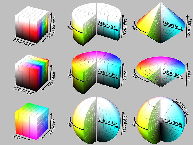
Form the right corner on the top, which in this image is red, if we move to the left, the color will be tinted until it reaches the white color, and if we move to the bottom, it will be shaded until it reaches the black color. And you can see the tone, which is in the middle.


SATURATION
Saturation is the intensity or purity of the color. It’s a color term commonly used by (digital/analog) imaging experts.
Saturation is usually one property of three when used to determine a certain color and measured as a percentage value.
Saturation defines a range from pure color (100%) to gray (0%) at a constant lightness level. A pure color is fully saturated.


A desaturated image is said to be dull, less colorful, or washed out, but it can also give the impression of being softer.
The distance from the gray center of this image indicates how saturated your color is. High saturation is far from the center, and low saturation has more gray.

LET’S SEE HOW WE CAN APPLY THIS INFORMATION TO OUR WORKS:
In this painting by Alfred Stevens, the only color used in this painting is red so just mixing it with white and black changes the saturation and the value so the painter was able to create an entire image from just one color. This method is called the Monochromatic scheme.

We can even use this method for our DAILY LOOK.
As you can see in this image, The girl used different shades of blue to match her clothes, bag, shoes, sunglasses, and earrings. This is one of the ways that we can look stylish by choosing shades of the same colors.
.jpg)

LIGHTNESS
Lightness is usually one property of three when used to determine a certain color and measured as a percentage value.
-
100% lightness is white, 0% lightness is black, and 50% lightness is “normal”
-
A certain color can be defined by hue (0° - 360°), saturation (0% - 100%) and lightness (0% - 100%)
-
A painter might say lightness is the range from fully shaded to fully tinted
-
You can lighten or darken a color by changing its lightness value
LUMINANCE (BRIGHTNESS)
Luminance is the amount of brightness or light in a color.
Each hue naturally has an individual luminance value.
Luminance improves your color choices.
When you know luminance values, you also know the amount of contrast between two colors.
Contrast as in the distance of luminance between two colors. For one color you always know the contrast value in relation to any grayscale value.
Color decisions need to consider luminance/contrast because it is key to usability. It's the most powerful visual information - before hue and saturation - and therefore best capable of guiding attention.

_edited.jpg)
This is how we create color contrast (hue).
For example, mixing yellow with violet always works.
Because, as you can see, the brightness of yellow is 94% and we knew that yellow is the brightest color in the human eye and the brightness of violet is only 44%, so these two colors together make a good contrast.
_edited.jpg)

Here you can see two color models to understand brightness and lightness better.
HSV (Hue, Saturation, and value), and HSL (Hue, Saturation, and lightness)
We have different color models that you will learn in the future; just know that some color pickers in software use the HSB system.
_edited.jpg)